Tarot Journal
Tarot Color Symbolism: A Deck-Specific Reading Method
Tarot color symbolism is most useful when you read palette, placement, contrast, and change inside a specific deck before assigning any color a fixed meaning.
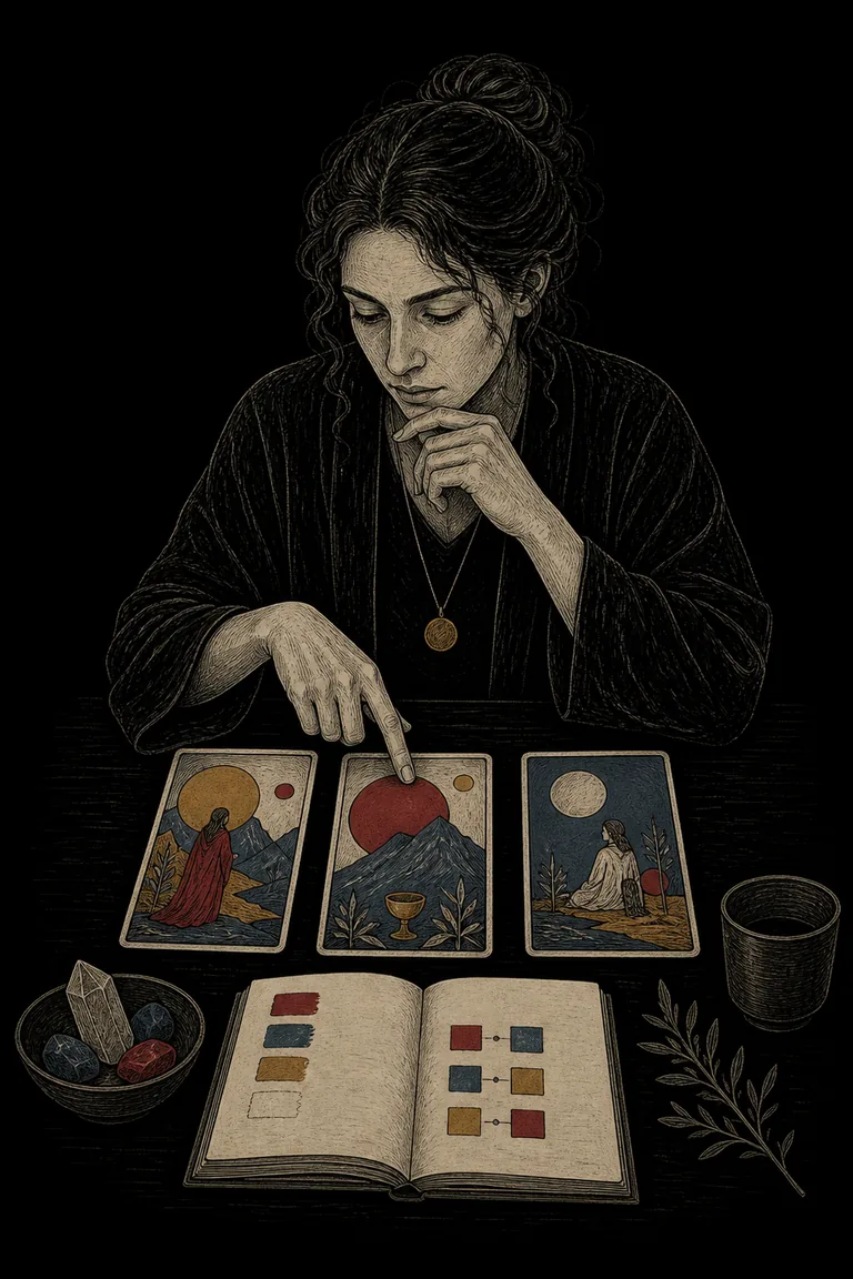
Tarot color symbolism describes how hue, value, saturation, contrast, and repetition help organize a card image. A red cloak, pale sky, dark doorway, or repeated patch of blue can direct attention, separate figures, build atmosphere, or connect cards across a spread. Color can support interpretation, but it is not a universal code.
A grounded method starts with what the deck visibly does. Identify the dominant color, locate smaller accents, compare warm and cool areas, and note what changes across the spread. Only then add deck history, creator notes, personal associations, or traditional correspondences. This keeps color connected to the image instead of turning a familiar palette into a prediction.
Take the next insight with you
Explore personalized Tarot guidance in Veritas, available for iOS and Android.
 Scan with your phone
Tarot color symbolism at a glance
What color can and cannot tell you
Color can show visual emphasis, atmosphere, similarity, difference, movement, and hierarchy. It cannot independently reveal a person's feelings, moral character, diagnosis, secret intention, or future event. Start with the broader Tarot card symbolism guide: observation is evidence from the card, while meaning is a proposal that still needs context.
Color evidence versus color association
A statement such as the figure wears a vivid red garment against a pale ground is observable. Saying red means courage, anger, desire, danger, vitality, or authority introduces possible associations. Several may fit. Ask what the red touches, what it excludes, whether it repeats, and what the figure is doing. The relationship between color and scene is stronger evidence than the color name alone.
A five-pass color reading method
- Inventory the palette
Name three to five visible color families without interpreting them, including light, dark, muted, and vivid areas.
- Map placement
Record whether each color belongs to sky, clothing, ground, object, border, shadow, or empty space.
- Find relationships
Notice contrast, repetition, containment, interruption, progression, and any color that appears only once.
- Offer two functions
Propose at least two ways the important color relationship could organize the scene.
- Test the reading
Check the deck source, spread position, neighboring cards, exact question, and one fair rival interpretation.
Dominant color and visual weight
The dominant color is not always the color covering the most pixels. A small saturated red shape can outweigh a large muted blue field because it attracts the eye first. Record both area and visual pull. Then ask whether the dominant field supports, surrounds, confines, exposes, or distances the main action.
Accent colors and exceptions
An accent often identifies the point where the image wants attention. A gold key in a dark room may emphasize access; a pale hand within red clothing may emphasize a gesture. Do not assume the accent is automatically positive. Its function depends on what it marks and whether that feature helps, warns, divides, or simply balances the composition.
Contrast, harmony, and absence
Strong contrast can create separation, conflict, focus, or clarity. Related colors can create continuity, immersion, or reduced differentiation. Absence matters only against a declared baseline. If most cards in a deck use yellow skies, one grey sky may be meaningful; if yellow rarely appears, its absence proves little. Compare the card with the deck, not with an imagined universal palette.
Worked example across three cards
Imagine a three-card spread moving from a muted blue room, to a figure in red crossing an ochre threshold, to an open landscape where blue and red appear as small balanced accents. A color-first description suggests movement from immersion, through concentrated action, toward integration. A rival reading is that the sequence merely shifts from indoor shadow to outdoor light. Use the spread positions and question to decide whether either reading adds practical clarity. The Tarot storytelling method helps keep that sequence tied to visible change.
Color across neighboring cards
Look for a color that travels, disappears, expands, or changes owner. Red may move from background to clothing, or blue from one person's vessel to a shared stream. Describe the transition before naming a theme. In a card combination, repeated color is one connector among posture, direction, suit, number, and position.
Deck history changes the reading
Hand-painted historical decks, restricted stencil palettes, early commercial printing, and modern digital art create different color conditions. The Rider-Waite-Smith family often invites comparison with Pamela Colman Smith's dramatic color choices and later occult correspondences. Marseille decks may use a tighter printed palette. Modern creators may establish an entirely new system. The Rider-Waite-Smith versus Marseille guide helps separate visual tradition from universal claims.
Traditional correspondences are optional layers
Some traditions connect colors with elements, planets, Qabalistic scales, alchemical stages, or psychological qualities. Use a named source and verify that the deck actually follows it. A correspondence can add a deliberate second layer, but it should not erase the printed scene. If the image contradicts the table, record the mismatch instead of forcing agreement.
Color vision, printing, and screens
Readers do not perceive color identically. Color-vision differences, low light, aging paper, print runs, filters, and screen settings can shift a palette. Add value, texture, position, and shape to the description so the reading does not depend on distinguishing one hue. When color identity is uncertain, say warm dark area or pale high-contrast object rather than pretending precision.
Save a color audit you can review
Use Veritas to record the palette, placement, contrast, two possible functions, deck source, rival reading, practical question, and later evidence.
A practical color journal exercise
Choose one card and spend one minute listing color facts only. Then write one sentence about dominance, one about contrast, and one about change or absence. Add two interpretations and one ordinary compositional explanation. Revisit the entry after reading the guidebook. A Tarot journal will show which associations remain useful across decks and which belong to a single image or mood.
Common mistakes
Common errors include assigning one fixed meaning to every red, blue, black, or white object; ignoring palette differences between decks; treating a faded reproduction as the original; calling a color absent without a baseline; and letting color override the question or spread position. Another mistake is using a dramatic color claim only after an outcome is known.
Limits and responsible use
Tarot color symbolism is an interpretive visual practice, not a validated way to discover facts, diagnose conditions, judge danger, prove spiritual status, or predict events. Use color to generate a question you can answer through observation, conversation, records, or a small reversible action. For agency-centered prompts, see questions to ask Tarot.