Tarot Journal
Tarot Contrast Symbolism: An Evidence-First Guide
Tarot contrast symbolism becomes useful when you name the compared elements, isolate one visible difference, and test how that difference functions in the card or spread.
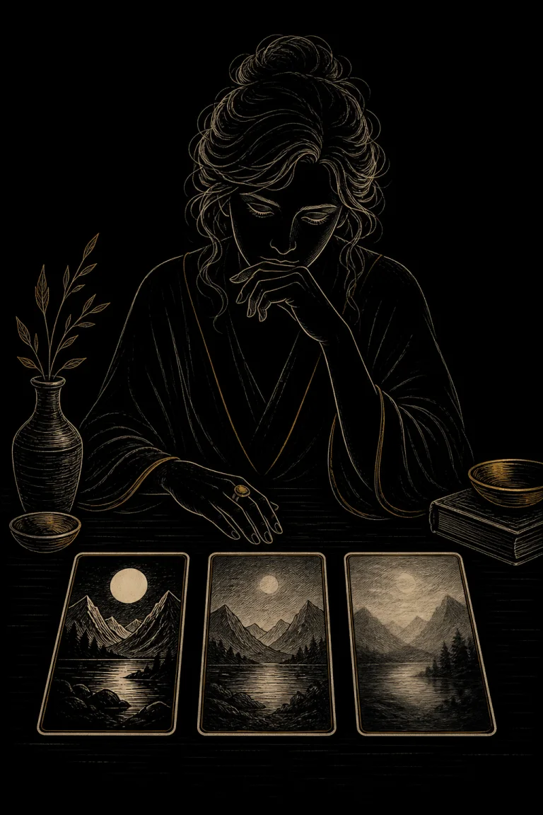
Contrast in Tarot is the visible difference between two or more elements. A pale figure may stand against a dark field, one object may be much larger than its neighbors, a sharp contour may interrupt soft clouds, or an open doorway may oppose a sealed wall. Contrast can guide attention, separate roles, create tension, or make a choice legible. It does not carry one universal meaning.
Start by naming both sides of the comparison and the variable that differs. Then describe the degree, location, and scene function before adding symbolic language. A strong contrast may be ordinary for the deck, while a subtle difference may matter because of the question or spread position. Neither kind proves conflict, virtue, danger, hidden intent, or a future event.
Take the next insight with you
Explore personalized Tarot guidance in Veritas, available for iOS and Android.
 Scan with your phone
Tarot contrast symbolism at a glance
What contrast means in a Tarot image
Contrast is relational. An object is not large in isolation; it is large compared with something else in the frame or deck. A line is not sharp without a softer neighboring edge. Write the comparison as a sentence: the foreground figure is lighter than the doorway, or the left vessel is wider than the two beside it. The Tarot card symbolism guide helps inventory visible evidence before interpretation.
Choose one variable at a time
One pair can differ in several ways. A red cloak may also be larger, sharper, nearer, and more isolated than the background. If every difference is interpreted at once, the reading becomes impossible to test. Begin with the variable that most clearly controls attention. Add a second variable only when it changes or qualifies the first claim.
Describe degree, not just opposition
Many contrasts are gradual rather than binary. Two blues can differ slightly in value; one figure can be moderately taller; an edge can shift from crisp to hazy. Use terms such as slight, moderate, and strong, then explain the visible basis. A small difference repeated across a spread may matter more than one dramatic effect that appears throughout the deck.
Check the deck baseline
Compare several unrelated cards from the same edition. If every central figure is pale against a black field, that contrast is an illustration system, not a special message unique to one draw. It can still organize the scene, but the claim should remain proportional. Crops, recolors, borderless editions, and digital screens can change the apparent strength of a contrast.
Value contrast: light against dark
Value means relative lightness or darkness, independent of hue. High value contrast can make a subject readable at a glance; low contrast can merge forms or delay recognition. First ask what becomes visible and what recedes. The light and shadow guide examines illumination and cast shadow, while contrast analysis compares relative values between named areas. Darkness alone is not evil, and brightness alone is not truth.
Color contrast without a fixed dictionary
Warm and cool hues, complements, saturation differences, and one accent among muted colors can separate subjects or link positions. Record the actual pigments and printing conditions before using an association. The color symbolism guide keeps palette and deck conventions explicit. A red detail against green may command attention because of optical difference, not because it predicts passion or conflict.
Scale and proportion contrast
A large figure beside a small building can create hierarchy, intimacy, distortion, or dreamlike perspective. Compare actual printed size, apparent distance, and narrative role. The scale and proportion guide owns the fuller perspective analysis. Contrast tells you that the sizes differ; it does not prove that the larger element is more important in life.
Edge, texture, and material contrast
A crisp blade against soft fabric may separate precision from flexibility at the level of scene function. Smooth stone beside rough bark can distinguish surfaces, use, age, or contact. Do not convert physical properties directly into personality labels. Ask who touches each material, what the edge permits, and whether the contrast changes access, protection, effort, or attention.
Direction, spacing, and figure-ground contrast
One figure facing against a group, one wide gap inside a crowded row, or one open shape inside a dense field can create directional or spatial contrast. Describe the geometry before assigning narrative. A reversed-facing figure may be observing, leaving, resisting, or simply balancing the composition. Figure-ground contrast may reveal an overlooked object without making it a secret sign.
A six-pass contrast method
- Name the pair
Identify the two elements or groups that can be compared from visible evidence.
- Isolate the variable
Choose value, hue, size, edge, texture, direction, spacing, access, or another observable property.
- Estimate the degree
Describe whether the difference is slight, moderate, or strong and note any ambiguous boundary.
- Check the baseline
Compare the same variable in several unrelated cards from the exact edition.
- State two functions
Offer a primary scene function and one plausible alternative before selecting a reading.
- Test question fit
Connect the contrast to the named spread position and record what evidence would weaken the claim.
Worked example: a pale doorway in a dark wall
Imagine a card where a narrow pale doorway interrupts a broad dark wall. The pair is doorway and wall; the primary variable is value, with access as a secondary functional difference. A grounded reading might compare available passage with surrounding enclosure. It cannot establish that a new opportunity will appear. The doorway may also be an exit, a distant opening, or simply the artist's focal device.
Worked example: one small cup beside a large vessel
The visible contrast is scale between two containers. If the small cup is held while the large vessel is sealed, access and contact also differ. A question about resources might use the scene to compare what is usable now with what is stored or unavailable. It would be careless to declare scarcity, inheritance, or withholding without card position, surrounding cards, and real-world evidence.
Contrast across a spread
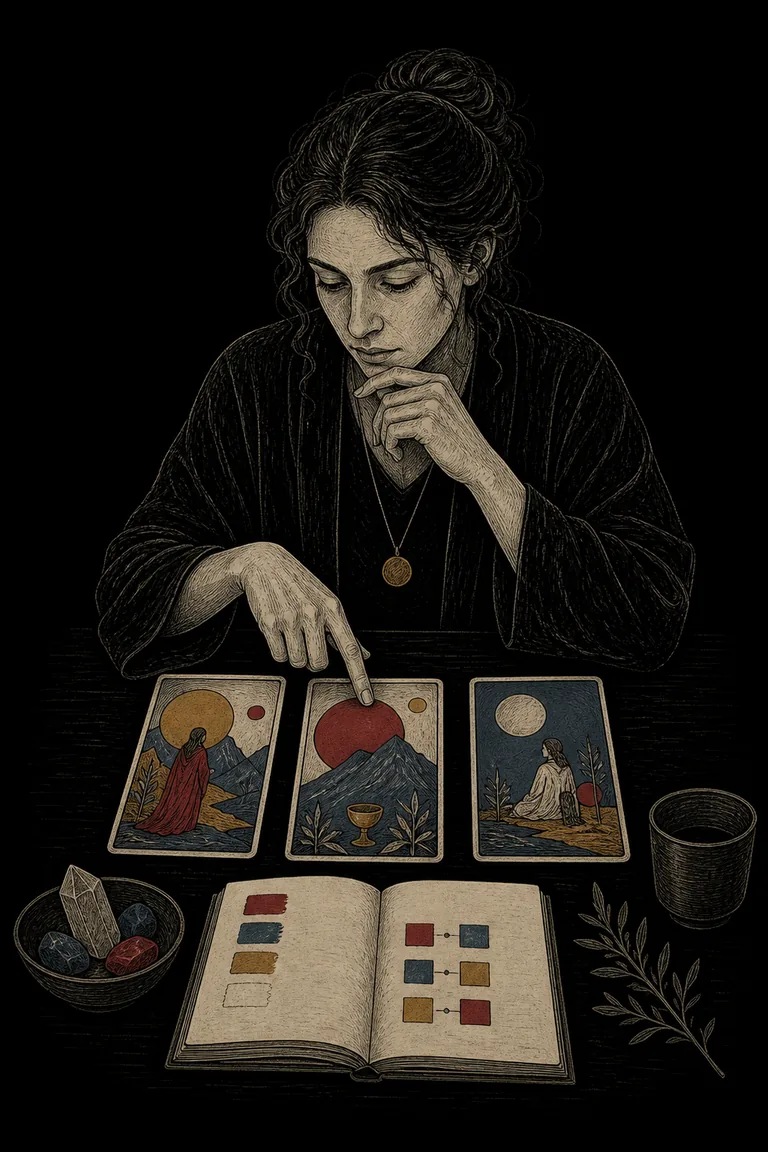
Read each position first, then compare the same variable across cards. A progression from crowded to open space may support a reflective story about changing options, but it does not create chronology unless the spread positions are temporal. The card combinations guide helps preserve position and sequence instead of flattening three images into a generic binary.
Contrast and repetition are different relations
The repetition guide owns recurrence, count, spacing among repeated units, variation, and interruption. Contrast owns a visible difference between named elements. A spread can contain both: three repeated circles may establish a motif, while one filled circle contrasts with two open circles. Record the repeat first and the changing variable second so the two claims remain clear.
Contrast and whole-frame composition
The composition guide examines focal path, balance, grouping, depth, and negative space across the whole frame. Contrast is one mechanism composition can use. Do not assume the strongest contrast is automatically the complete message. A quiet background relation may answer the named question more directly than the brightest focal point.
Reversals, editions, and accessibility
Reversal changes orientation but usually preserves printed value, color, scale, and texture contrasts. It may change how directional or upper-lower relations meet a spread position. Compare the physical card rather than imagining new artwork. For accessibility, describe contrasts in more than color alone, check images in grayscale, avoid relying on tiny details, and note when glare or low screen brightness changes the evidence.
Save the comparison before the conclusion
Use Veritas to record the compared elements, visual variable, degree, location, deck baseline, two possible functions, spread position, question fit, and evidence that would change the reading.
Questions that keep contrast grounded
Ask whether the difference is printed or caused by lighting, crop, wear, or display settings. Ask which element receives attention, what role each side performs, whether the contrast repeats elsewhere, and whether a third element complicates the pair. Finally, test a nonbinary reading. A useful contrast can organize competing needs without dividing people into good and bad sides.
Common mistakes and responsible limits
Common mistakes include comparing unnamed elements, mixing several variables into one claim, treating every difference as conflict, ignoring deck conventions, and reading high contrast as urgency or danger. Tarot is a reflective practice, not scientific prediction or surveillance. Visual contrast cannot replace consent, direct communication, medical care, legal advice, financial evidence, or safety planning. Keep observations in a Tarot journal and visit the <a href="/tarot">Tarot journal hub</a> for related methods.