Tarot Journal
Tarot Visual Weight Symbolism: An Evidence-First Guide
Tarot visual weight symbolism maps what attracts attention first, what holds it, and which visible variables make one area feel heavier or lighter than another.
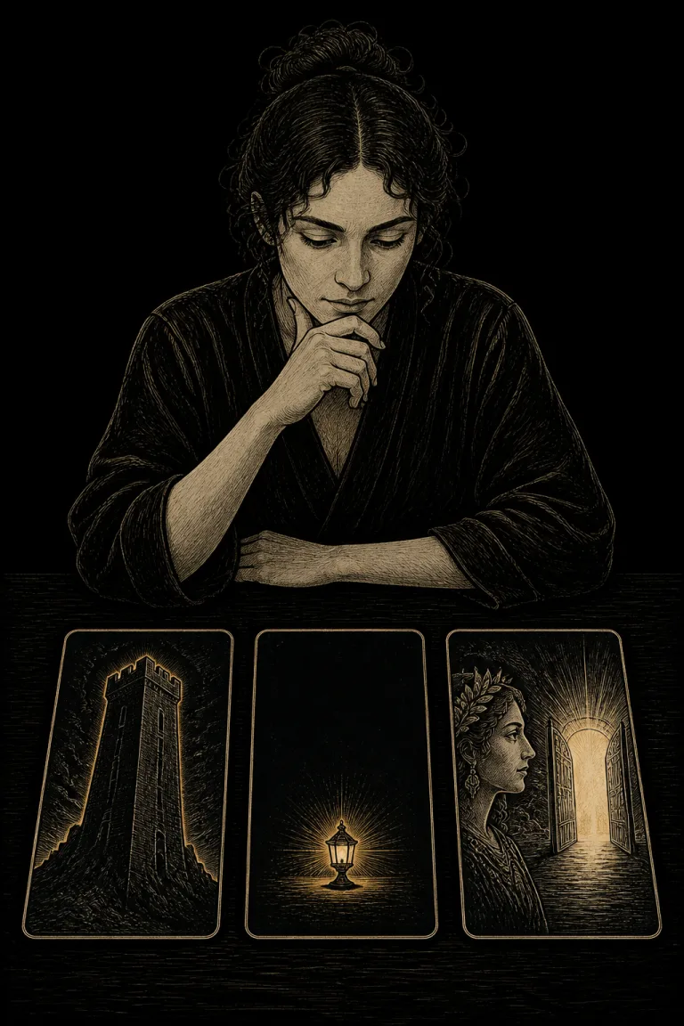
Tarot visual weight symbolism begins with attention rather than a keyword. A large dark tower may dominate one card, while a tiny bright lamp surrounded by empty space dominates another. Size, contrast, density, position, isolation, detail, direction, and familiar forms can all make an element feel visually heavy. That prominence tells you where the image organizes attention, not what event must happen.
Map the strongest focal area, name the variables producing its weight, and compare the rest of the card and the deck baseline. Then test at least two scene functions. Visual weight can reveal hierarchy, pressure, access, interruption, or emphasis, but it cannot independently prove importance in real life, emotional intensity, danger, truth, value, or timing.
Take the next insight with you
Explore personalized Tarot guidance in Veritas, available for iOS and Android.
 Scan with your phone
Tarot visual weight symbolism at a glance
Visual weight is relative attention
An element is visually heavy when it competes successfully for attention within a particular image. The effect is relational. A black circle can dominate a pale card but disappear inside a dense dark scene. A face may attract attention even when it is small because human viewers are practiced at detecting faces. Record what you notice first, second, and third, then identify the visible reasons. Do not turn the first glance into an interpretation before the evidence is named.
Keep visual weight separate from symbolic importance
The most prominent object is not automatically the most important issue in the reading. An artist may enlarge a mountain to establish location, darken a wall to frame a doorway, or isolate a cup so its shape remains legible. Card symbolism asks what visible details can contribute to meaning. Visual weight asks why one detail wins attention. Spread position, question, action, and neighboring cards still decide how much interpretive weight it deserves.
Build a visual-weight inventory
- Record the glance order
Without interpreting, note the first three areas your eye visits and whether attention stays, returns, or moves onward.
- Name the variables
Identify size, darkness, brightness, saturation, texture, detail, isolation, position, overlap, face recognition, or directional lines that create the pull.
- Map counterweights
Find the quieter areas that balance, frame, oppose, or redirect the main focal area. Include empty space and borders.
- Compare the deck
Sample cards with similar subjects to learn whether heavy shadows, oversized figures, bright halos, or isolated objects are ordinary design grammar.
- Test two functions
Write one practical design function and one symbolic possibility, then test both against the depicted action and spread question.
- State uncertainty
If two areas compete or your attention changes with magnification, record a split or unstable focal hierarchy instead of forcing one winner.
Size and scale are related but not identical
A large object usually carries more visual weight, yet a small high-contrast detail can outweigh it. Scale concerns relative depicted size and proportion; weight concerns attention produced by all variables together. A huge pale moon may recede behind a tiny black bird. Use the scale and proportion guide to describe size relationships, then ask whether contrast, isolation, or position changes which element actually dominates.
Contrast creates weight at boundaries
Strong light-dark, warm-cool, smooth-rough, or sharp-soft differences make boundaries easy to detect. A bright key on a dark floor may become the focal point because its edge is clear, not because keys always carry more meaning. The contrast guide helps name the compared variable and degree. Check whether the contrast reveals access, separates groups, marks damage, improves legibility, or merely follows the deck palette.
Position changes how weight is experienced
Centered elements often feel stable because the frame supports them. An equally sized object near an edge may feel tense, cropped, departing, or exposed because it has less surrounding room. Upper elements can seem elevated while lower elements can feel grounded, but those are hypotheses rather than universal laws. Describe the actual support, route, gravity, and action. Composition symbolism covers the whole arrangement; visual weight maps the relative pull inside it.
Negative space can make a small object heavy
Empty space is not an absence of evidence. A lone vessel in a wide blank field can attract more attention than ten vessels in a crowded cabinet because isolation removes competition. Ask whether the open area provides movement, silence, exposure, distance, or simple legibility. Then compare another card from the same deck. A recurring empty background may be normal style, while an unusual isolated object may be a stronger compositional event.
Symmetry can distribute weight without equal meaning
Symmetry symbolism tests correspondence across an axis or center. Visual weight tests attention. Two mirrored figures can have equal placement but unequal weight if one is darker, larger, more detailed, or looking directly outward. Conversely, asymmetrical objects can feel balanced when a large quiet form is countered by several small high-contrast forms. Do not call visual balance equality, consent, justice, or compatibility.
Directional pull can move attention
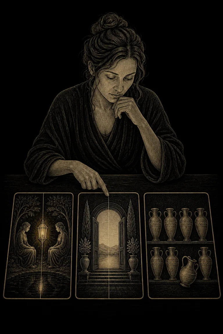
A face, pointing hand, road, weapon, beam, or flowing garment can send attention toward another area. The initial focal point may therefore function as a launch rather than a destination. Trace where the cue starts, where it points, and whether the route is open, interrupted, or circular. The direction guide keeps orientation distinct from presumed intent. A figure looking at a gate does not prove that the figure will pass through it.
Worked example: tower, lamp, and divided scene
Imagine three cards from one deck. The first contains a large dark tower beside several pale travelers. The tower dominates through size and tone, but the travelers provide action and direction. The second shows a tiny lamp alone in a broad dark chamber; isolation and brightness make it heavier than its size suggests. The third divides attention between a detailed face at the left edge and a bright open gate on the right. A careful reading records hierarchy, guidance, and competing attention as possibilities, while rival explanations include scene setting, legibility, and the artist's normal use of black fields. None predicts authority, rescue, departure, or a deadline.
Visual weight across a spread
Place the cards according to the spread before comparing focal areas. A visually heavy card in a minor position does not automatically override the spread design. Instead, ask whether focal directions connect, whether dark masses accumulate on one side, or whether one small bright detail repeats. Use the card combinations method to connect visible evidence with assigned positions and the question rather than treating the loudest image as the answer.
Reversals change gravity and frame position
Reversal exchanges top and bottom and can make a grounded mass appear suspended or a bright upper detail move lower in the frame. Left-right relations usually remain unchanged from the viewer's perspective. Describe the upright map first, decide your reversal method in advance, and then note what genuinely changes. The reversed Tarot guide offers consistent options. Do not invent extra weight merely because an image feels unfamiliar upside down.
Accessibility and changing attention
Attention differs with vision, color perception, screen brightness, card size, and familiarity. Use broad variables such as large shapes, strong tonal boundaries, faces, openings, and isolated landmarks. Magnification or a reliable image description can help. If color contrast is unavailable, compare value, contour, density, and position. A method remains useful when it allows two viewers to report different glance orders and then discuss the visible reasons.
Save a visual-weight map
Use Veritas to log glance order, focal areas, weight variables, counterweights, deck baseline, two possible scene functions, uncertainty, and what later evidence supported or challenged the reading.
A practical journal protocol
Choose one card and look for three seconds. Write the first area noticed, then study the card and list every variable that may have created the pull. Draw a simple map with heavy, medium, and quiet zones. Compare two cards from the deck with similar subjects. Finally, write one design function and one symbolic possibility for the strongest area. A Tarot journal makes changes in attention visible across repeated reviews.
Common mistakes and responsible limits
Common mistakes include equating size with importance, ignoring small high-contrast details, treating empty space as meaningless, confusing symmetry with equal weight, ignoring faces and directional cues, and assuming every viewer sees the same hierarchy. Tarot visual weight symbolism is an interpretive design method, not proof of urgency, danger, truth, value, diagnosis, another person's feelings, or a future event. Use direct observation, records, qualified advice, and ordinary safety checks for consequential choices. Visit the <a href="/tarot">Tarot journal hub</a> for related reading methods.